When it comes to modern web design, simple is always better. And while this is good news for web designers – meaning over-the-top design is no longer necessary – it’s arguably more challenging. You have to say more with less, which makes every design element that much more important. This is especially true when you consider the role of images and visuals in web design.
4 Helpful Tips for Best Results
As a designer, you’re well aware of the fact that the internet is becoming an increasingly visual place. In 2014, video was responsible for 64 percent of global consumer internet traffic. By 2019, that number is expected to balloon to 80 percent. In addition, items like infographics, memes, image galleries, and GIFs are growing in popularity.
Ultimately, this means only web pages that are designed for visual consumption will be effective in the coming months and years. With that being said, there’s a difference between low quality and high quality visuals. Make sure you keep the following tips in mind.
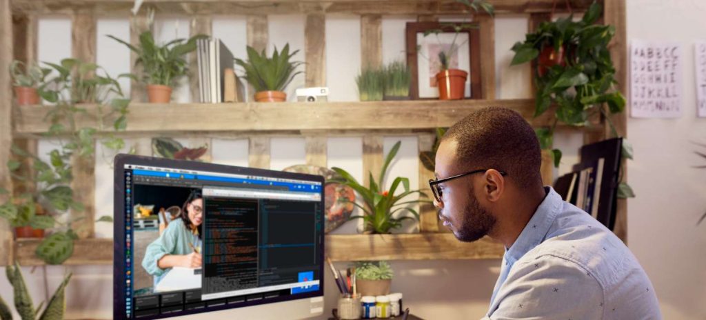
1. Ditch Stock Photography
The first tip is to avoid using stock photography. Stock images don’t qualify as high quality. They’re recycled, regurgitated, and stale. If you’re using stock images throughout your website, then conversion rates are probably suffering.
“Stock images aren’t inviting. They aren’t friendly. They don’t make people want to do business with you,” writes Kourtney Elam, a successful web designer. “People prefer to buy than to be sold to, and cheesy stock images scream selling.”
If you absolutely must use stock photos – for reasons related to cost and convenience – be prepared to spend hours searching for the right ones. Quality stock images are few and far between, but can occasionally be found. Just make sure you avoid cheesy ones, like these.
2. Use Large and High Resolution
Images need to be high resolution in order to be considered high quality. One of the biggest mistakes designers make is using pixelated images. These distorted images actually do more to harm than good for a page.
It’s also a good idea to use large images. Many websites are now moving towards the use of one large image per page as opposed to a handful of smaller ones. The benefit is that a single, high resolution image provides a cleaner look than multiple scattered images.
3. Let Images Guide the User
Images can and should be used to guide the user. In other words, let your images serve as directional cues to point the user towards the next step in the conversion funnel. For example, if you have a CTA on a landing page, your central image could be of a person looking in the direction of the CTA button. This subtly encourages the user to focus their attention on this area of the page.
4. Learn to Love White Space
When talking about how to visually enhance your web design projects – this may seem like a strange tip – but it’s an important one. White space is your best visual tool in 2016. Users love minimalist designs and white space should be properly leveraged in order to maximize other visuals. Check out these examples to get a good idea of how white space can help.
Make High Quality Visuals a Priority
Are high quality visuals a priority when you design websites and landing pages? If they aren’t, you’re on the verge of becoming irrelevant and outdated. The significance of visuals is rising as internet users become increasingly conditioned to quality visuals across all platforms. Make sure you’re keeping up with the times by placing an emphasis on this important aspect of design.